Nebul Global
Nebul is a global architectural firm and urban-planning firm based in Pretoria, South Africa.
With the increasing population and extreme urbanisation which has been said to grow by 80 million people every year, Nebul is aiming to redefine it’s focus towards sustainable projects in line with the latest advancements in technology and environmental practices by “building the future today”.
Solution
A visual identity that is clean, minimalist, and modern, using a colour palette that evokes stability, confidence, and sophistication. An identity that evoke feelings of progress, modernity, and sustainability, while also exuding a sense of reliability and trust.
Problem Statement
To stay ahead in the industry, Nebul seeks to redefine its focus by prioritizing sustainable projects aligned with cutting-edge technology and environmental practices, embodying its commitment to 'building the future today.' The problem lies in successfully navigating this shift in focus while ensuring operational efficiency and maintaining a competitive edge in the evolving architectural landscape."
Imagery
The use of sleek and contemporary design elements in the logo and promotional materials reflects Nebul's dedication to staying at the forefront of the industry. Incorporating architectural symbols and urban landscapes in the imagery reinforces the firm's expertise in shaping the future of cityscapes.
Understanding Application
Before diving into the case study, I was trying to understand this application and why it had to be redesigned. Starting off with an overall information architecture.
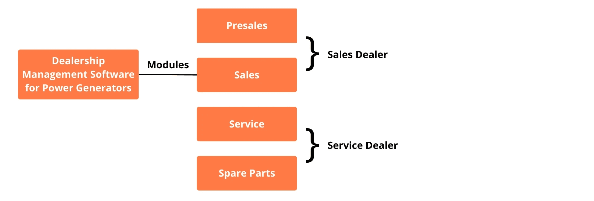
Who Is The User
For this specific client, they had sales and service users for this particular application.

Understanding Problem Space
To understand the problem area, we conducted heuristic analysis on the existing application, asking questions like "Is there a consistent icon design scheme and style across the dashboard?", "Can the users move eaily forward and backward in the graphs?", "Are prompts, cues, and messages placed where the eye is likely to be looking on the screen?", "Have large objects, bold fonts, and simple areas been used to distinguish sections?".

Consistency
Consistency in visual design such as icons, spacing, padding, icon styles

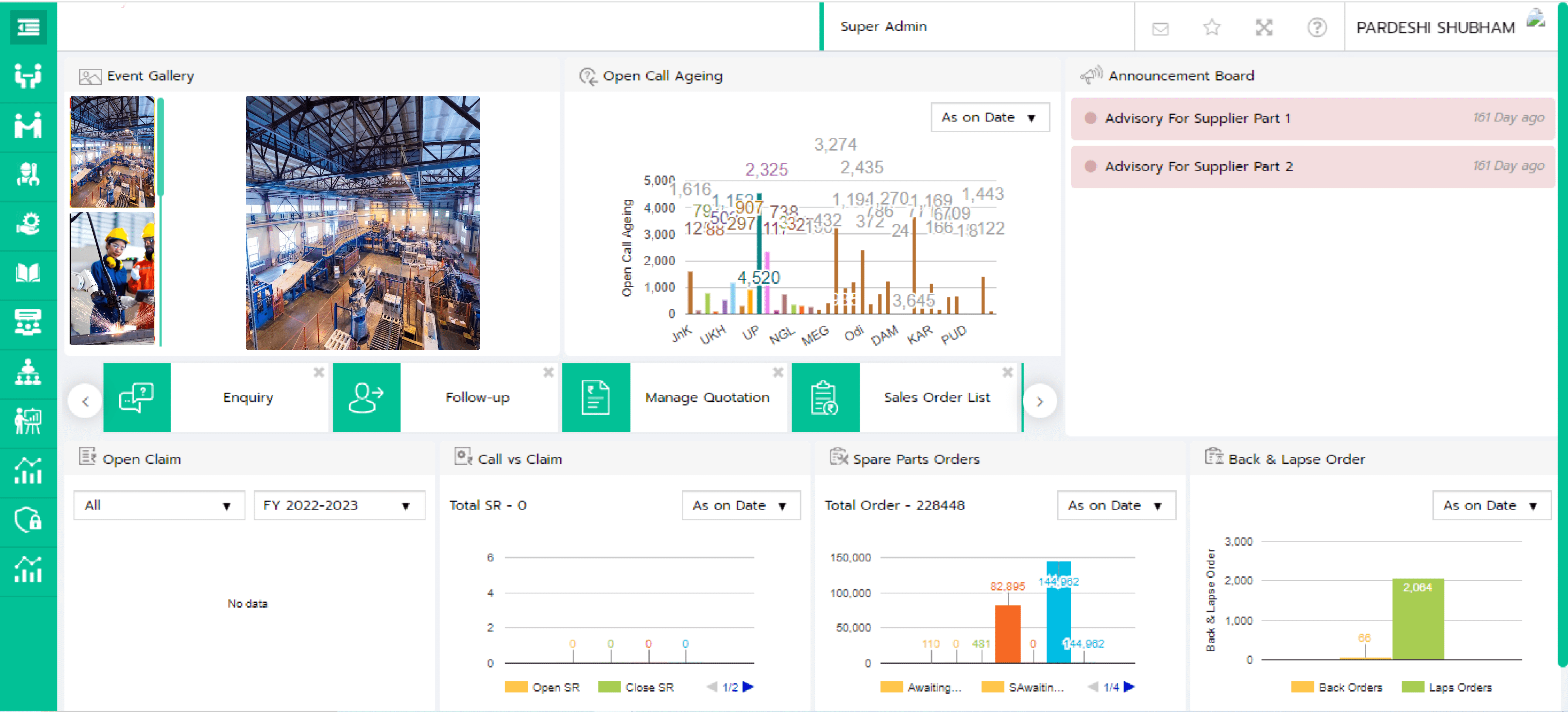
Discoverability
There were no clear exits, no tooltips or information for discovering table after clicking a card.
Clutter
There was a lot of clutter in the dashboard. The user wasn't able to see the important or relevant ones on the dashboard.
Lack of Visual Hierarchy
Users who were new, just started to the application were confused with information related to what.
Competitive Analysis
Conducted a competitive analysis, by watching videos trying and exploring softwares

User Pain Points and Solution
Shown are some screens of the existing UI and solutions I have provided.
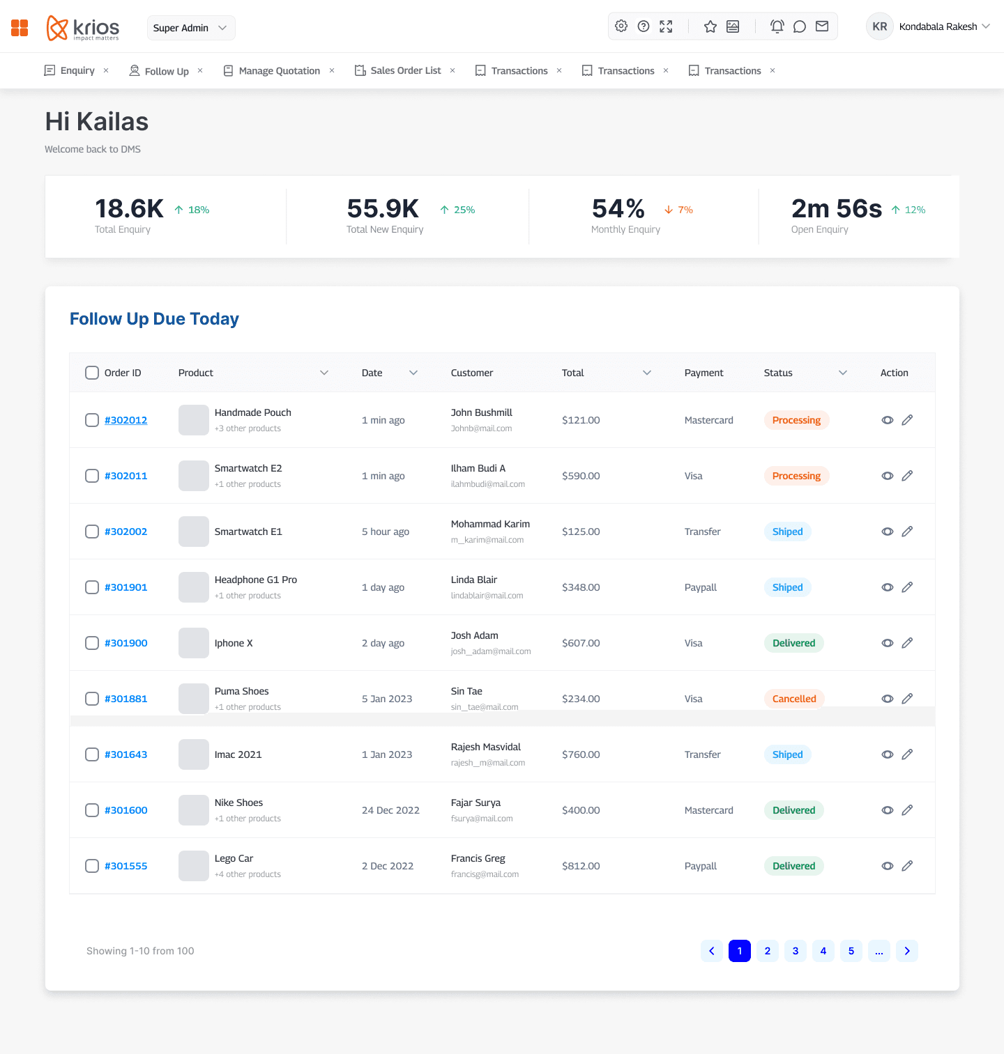
Shortcut Links and Icon Buttons Grouping
The shortcut or favorite links are placed at the top below the navigation for easy access and quick understanding. Announcement board and event gallery were not that important to be placed on the dashboard and can be accessed through icon button at the top. Icons were grouped for easy understanding.
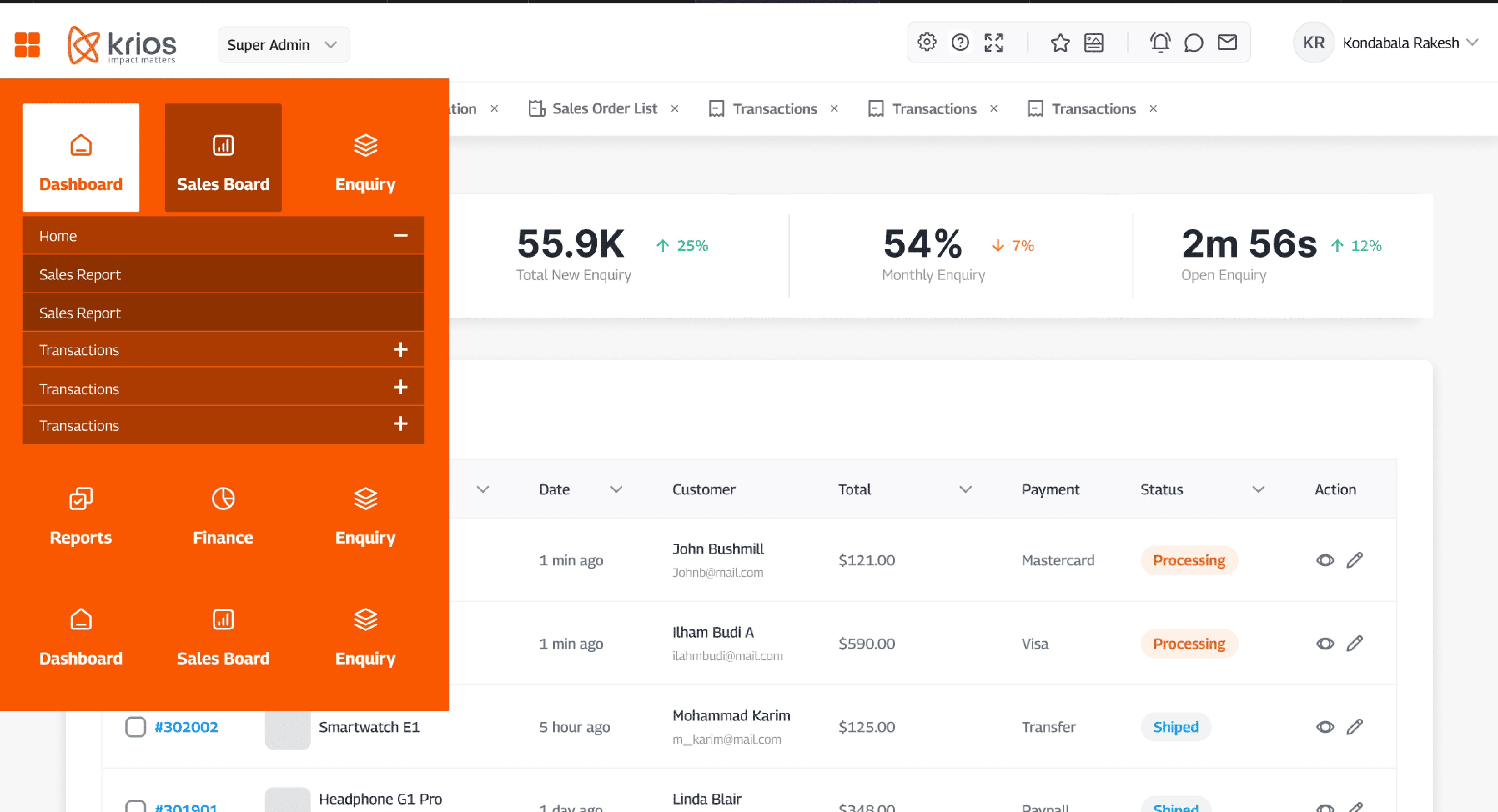
Full Screen View and Top-Left Navigation
The Client wanted a new navigation and data table and count to be on the dashboard, so coming up with a top-left navigation collapsable, where the user can get a full screen view of the data table. As, it was also noticed, the table in cards were very hard to read and had to be concentrated a lot.
Challenges and Learning
I understood how to work in cross-functional teams. I learned how to reduce the number of clicks, I had come up with ideas, where there were many technical constraints, I learned how it should be easier and reduce number of clicks. Learning to do small-small minute changes from the client.