Data Visualization Dashboard
This project showcases my story for designing a dashboard for a new company powered by Krios and Big Bang. This project shows iterations, and final designs, and challenges and constraints I received. This project is purely based on color combinations, layout, and visualizations depending on the data.
My Role and Timeline
Role- UI and Graphics Design Intern
Timeline- 1 Week
To be Developed in- Power BI
Company Requirements
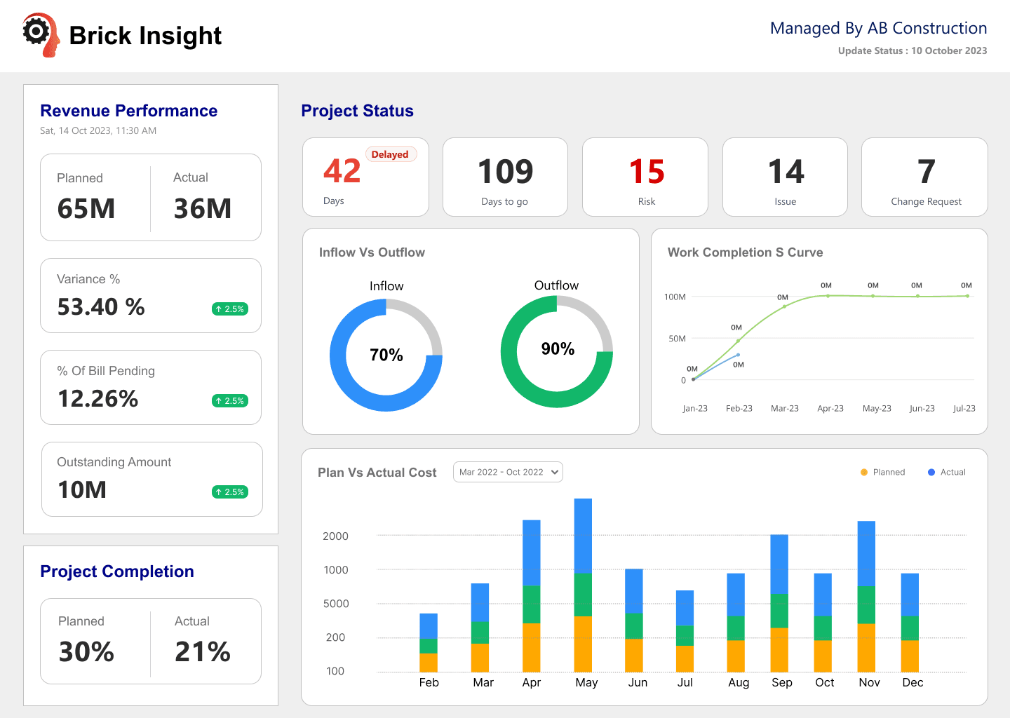
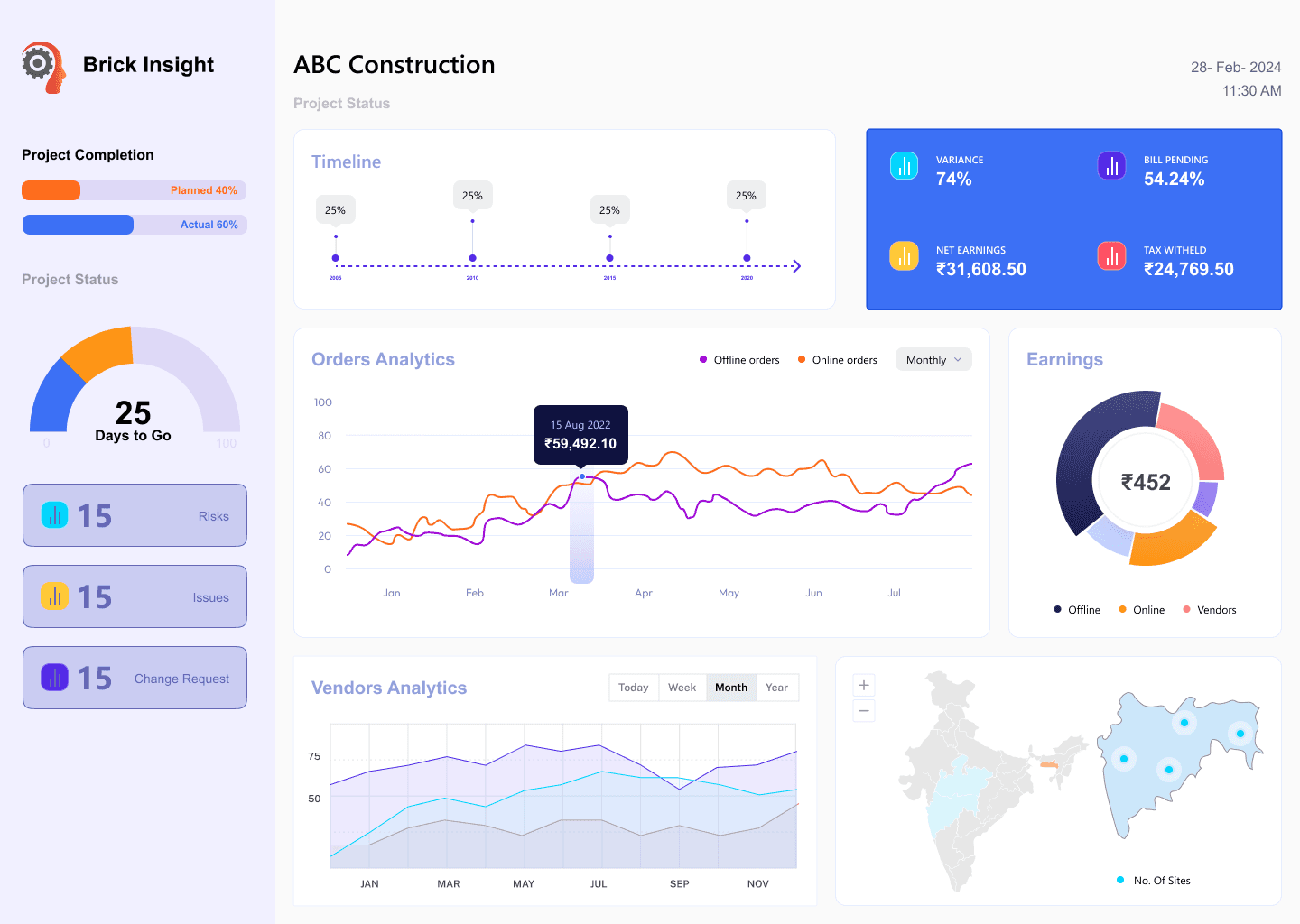
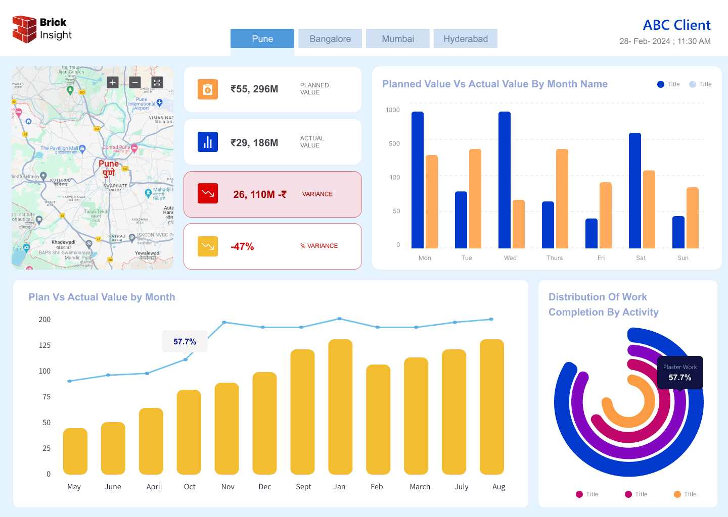
Brick Insight is developing for CEO Level dashboards for construction industry. The requirement I received was to design a dashboard and show the data provided, easier and faster to understand. It should be visually appealing, to show less text and more charts.
Before Designing…….Challenges Received

This project is to be developed in power bi. The constraints I received were in there were limited and specific fonts available in it. Same goes for shadows not available, and limited number charts available in the software. There were Arial, Segoe UI, Calibri, Candara, Comic Sans much more.. all word fonts. The charts available were pie charts, line graphs, bar graphs. Later, it was decided to use Segoe UI.
Iterations


Final Design

Challenges and Learnings
I have learnt a lot while designing this dashboard. First things first, collaboration. It was my first time real project where I had to communicate the requirements, asking and getting to know what could be developed and what could not. Researching about the development software, if there was something out there in the software, which might have missed from the developer. Coming up with list and then figuring out the design. I learnt a lot about collaboration and researching about development not just design or user or market. This was my biggest challenge and learning in this project.