Siemens Internship Project- Data Tables Re-Imagine
This project showcases my work which I completed in my 2 months internship project. I Conducted a competitive analysis, and based on my findings and insights reimagined data tables, improved keyboard navigation, and checked accessibility for tables used in Web based PLM software, resulting in a more user-friendly tables.
My Role and Timeline
Role- UX Research and Design Intern
Timeline- 2 months
Application- ActiveWorkspace PLM Software
Types of Users using PLM Software
Product Designers
Engineers
Manufacturing Teams
Supply Chain Managers
Quality Control Teams
Project Managers
Sales and Marketing Teams
Service and Maintaince
Regulatory and Compliance
Executive and Managers
Customers
Research and Innovators
Understanding Data Tables
In the course of their assignment, was tasked with the responsibility of researching, analyzing, and designing tables for Active Workspace, thus emphasizing the critical nature of well-constructed data tables in enhancing the functionality and user-friendliness of PLM software.
Starting with Listing down all the features of tables and segregating them into basic and advance features.
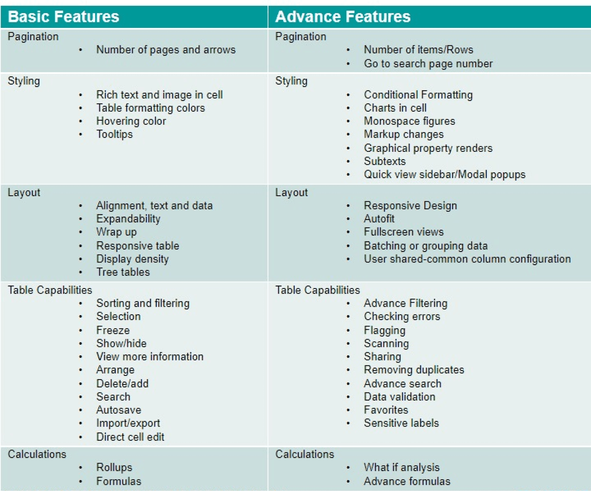
Table
Cell
Content
Type
Content
Empty
Text/Mixed
Numbers/Mixed
Dropdowns
Widgets
Graphical property
Calculations
Charts
Links
Read Only
Tooltpis
Text Formatting
Borders
Formulas
Selection
Favorites
Autosave
Flash fill
Comment/Note/Sensitive Labels
Normal
Active
Focus
Hover
Copy/Paste/Cut/Replace/Duplicate
Merge/Unmerge
Wrap Up
Alignment
Mono space Figures
Cell Color Styling
Editable
Placeholder
Interaction
Freeze/Unfreeze
Tooltips for column/row headers
Interaction
Group/Batch rows/columns
Stacked Nested subcolumns/subrows
Tree table(child, sibling)
Grouping
Actions
Styling
Actions
Table Formatting
Conditional Formatting
Markup
Show Errors
Expand/Shrink
Autofit Height/Width
Display Density
Configuration/Arrange
Rows/Columns
Styling
Layout
Formulas/Rollups
Selection
Favorites
Autosave
Insert/Delete/Remove
Sorting & Filtering
Search
Flagging/Rating
Import/Export
Data Validation
Advance Search/ Filtering
Copy/Paste/Cut/Replace/Duplicate
Merge/Unmerge
Removing Duplicates
Alignment
Simple Number Pagination
Bordered
Interactive wise Styling
Rounded
Next/Previous
Toggle Buttons
Lines
Radio Buttons
Icon arrow(Steppers)
Scrolling(Sliders)
Pagination
Behavior
Styling
Layout
Placement
On Overall Table
Enable
Disable
Number Of Pages
Summary of data(empty, filled, unique)
Search
Numbers of Rows/Columns/Data
Content
Actions
Headers
Commands
Styling
Layout
Interaction
Menu Bar
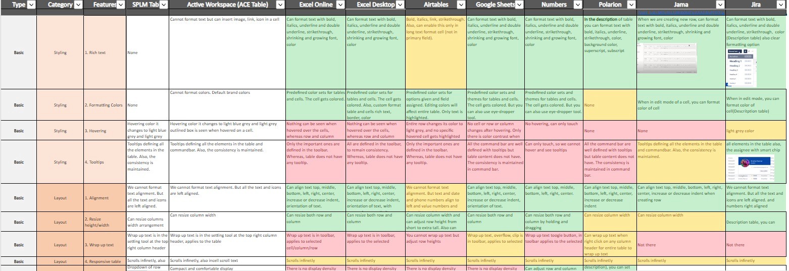
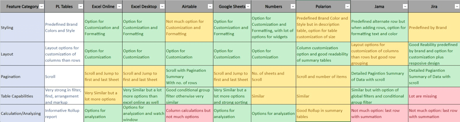
Comparative Indirect Competitors Analysis
A competitive analysis of data tables in terms of UX and UI encompasses styling, layout, pagination, table capabilities, and calculations. This evaluation helps identify best practices and areas for improvement, guiding decisions to enhance the user experience and data presentation. Please do not the research are screenshot images. Some of them are blurred.
Indirect Competitors
Excel- Online & Desktop
Airtable
Google Sheets


Apple Numbers
Polarion
Jama
Jira


Better than Us
LEGENDS
Similar than Us
Worse than Us
Unknown
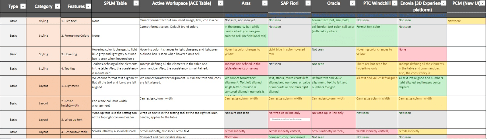
Comparative Direct Competitors Analysis
A competitive analysis of data tables in terms of UX and UI encompasses styling, layout, pagination, table capabilities, and calculations. This evaluation helps identify best practices and areas for improvement, guiding decisions to enhance the user experience and data presentation. Please do not the research are screenshot images. Some of them are blurred.
Direct Competitors
Aras
Oracle
SAP
Dassault Enovia
PCM New UI
(Product Cost Management)


PTC Windchill


Better than Us
LEGENDS
Similar than Us
Worse than Us
Unknown
Overview of Comparative Study
Better than Us
LEGENDS
Similar than Us
Worse than Us
Unknown
Direct Competitors
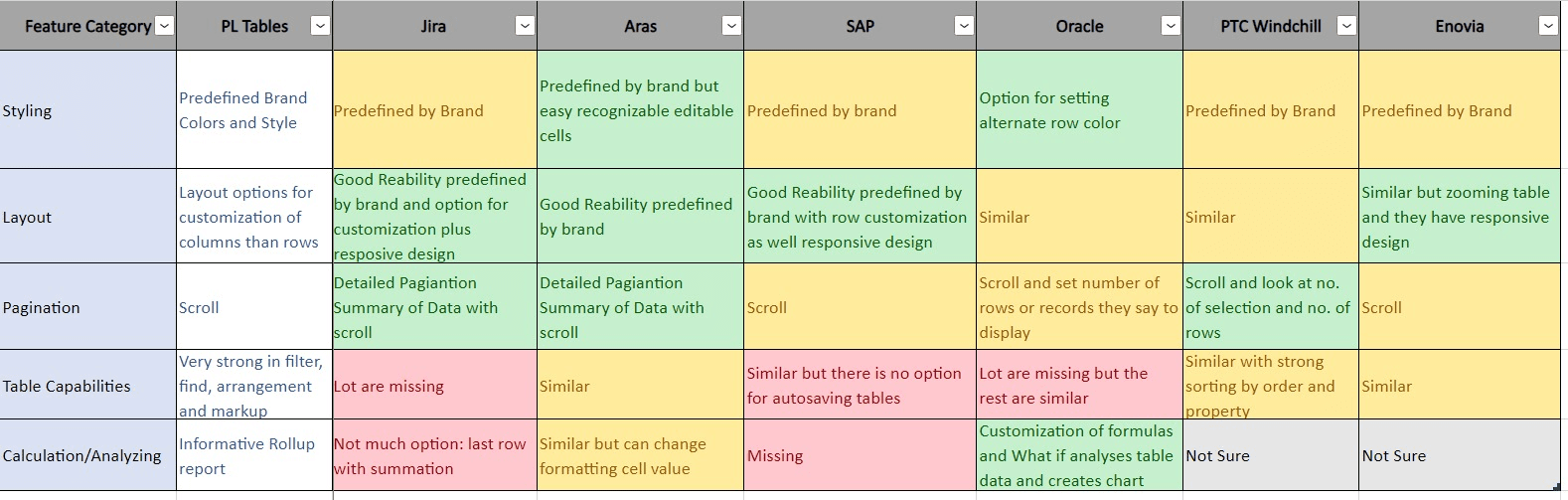
Indirect Competitors
Mockups: These mockups are based on my findings and what I reimagined them as
Created mock ups for tables after completing evaluation and research part. All the mockups are created in Axure RP 9. **Remember this is not a live project I was working on, was assigned on what could I reimagine their data tables as**
Major Findings:
Autofit width of column and height of rows instead of wrap up. (Can autofit selected ones also)
Readability in terms of alignment of text, numbers, widgets
Gridlines option in global settings to toggle on/off, giving user the choice
Customization of tables based on gridlines, banded, theme styles
Numbered pagination floating giving user the option to enable or disable
At a glance, you should be able to see the difference between editable cells and non-editable without going into edit mode, as they have direct cell edit.
In cell comments
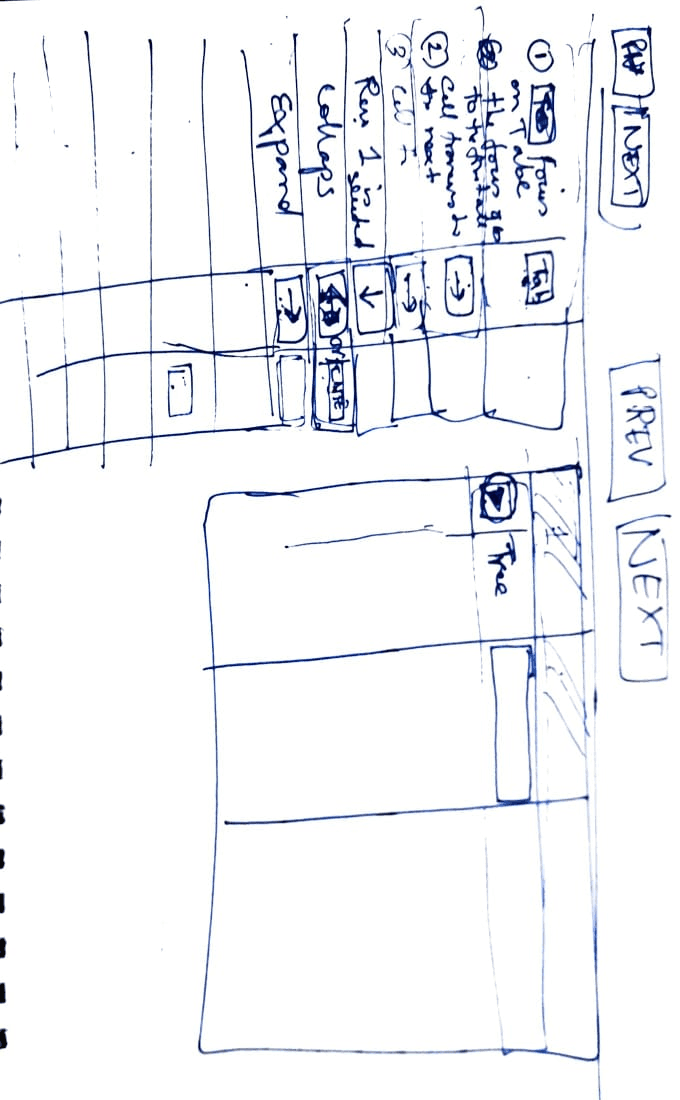
Instead of add row command in command bar, while the user is hovering on 1st column of table the blue line will be seen with plus sign. After clicking, numerous options to add.
Expand cell, instead of wrap text to whole table, they could just have, expanding into pop up to view inside content of cell.
Enhancement and elevation of freeze columns
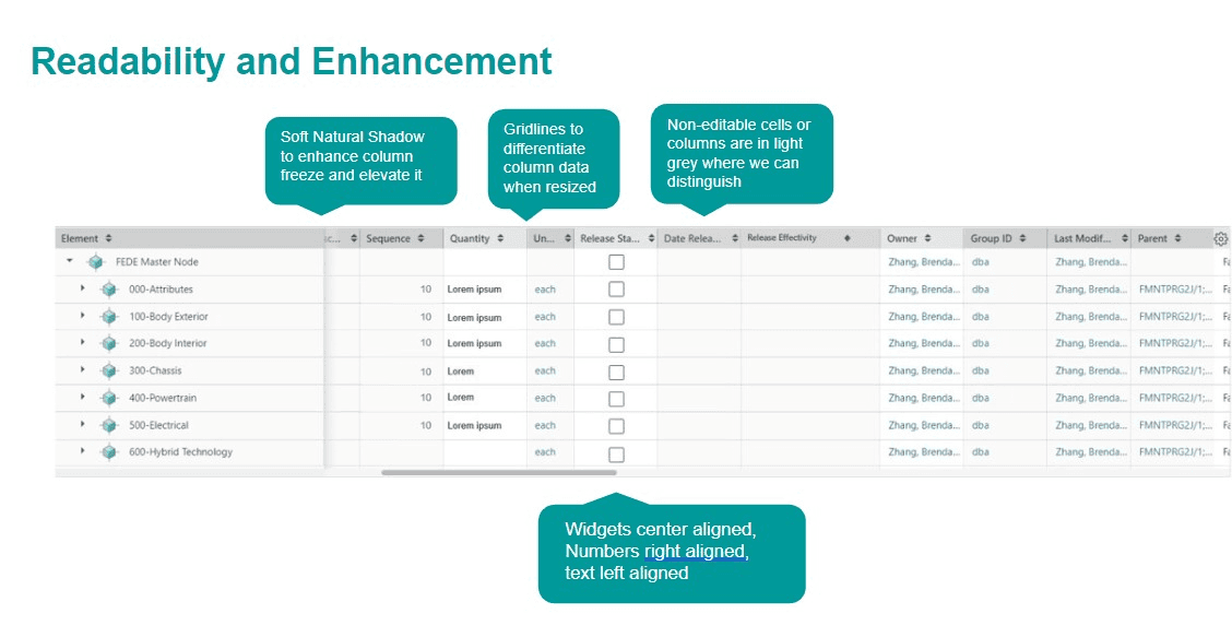
Readability and Enhancement:
1. Soft natural shadow to enhance column freeze and elevate it.
Gridlines to differentiate column data when resized.
Non-editable columns are in light grey where we can distinguish
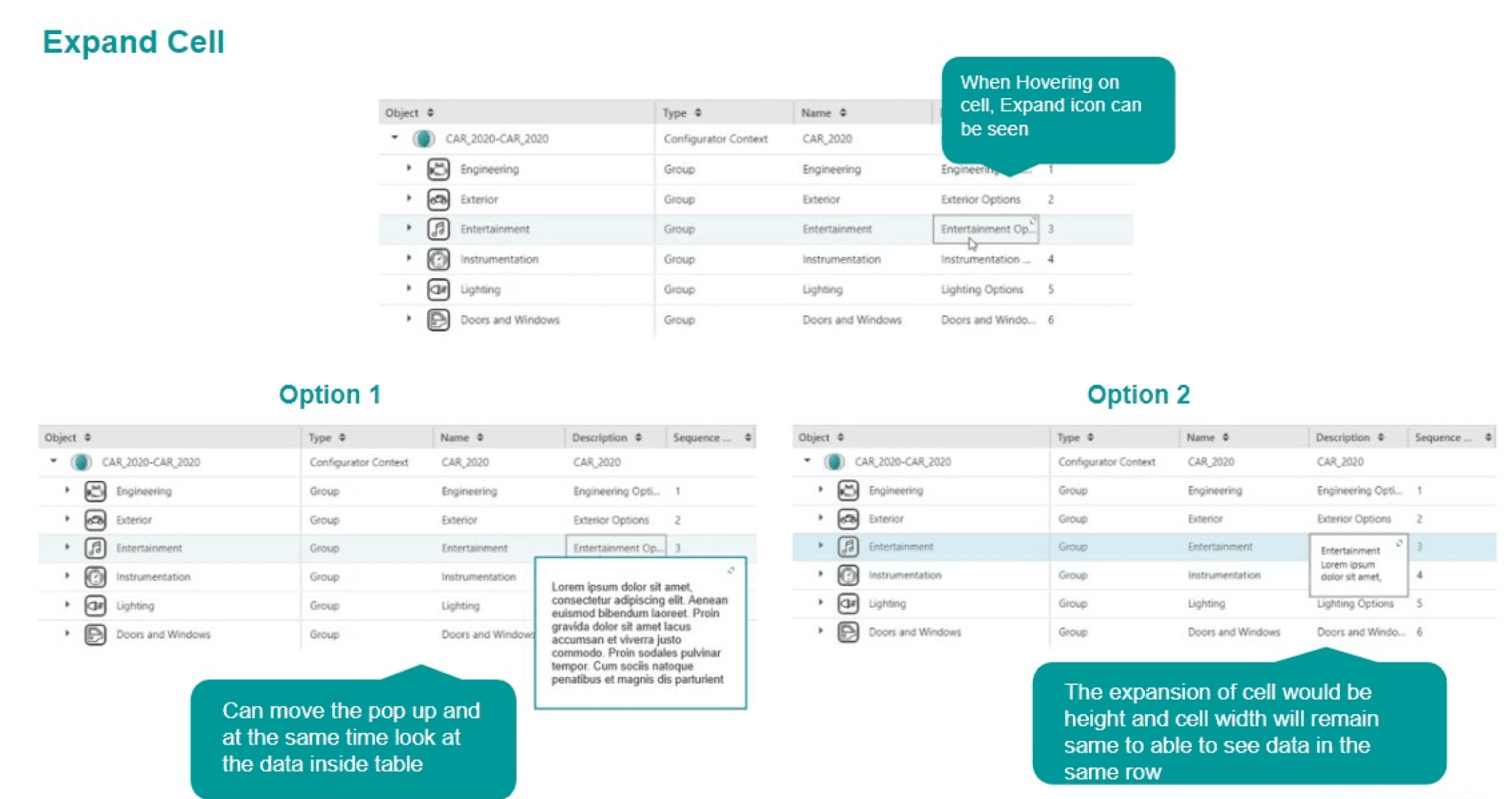
Expand Cell: 2 options I think were possible
When hovering on cell, expand icon could be seen
Option 1: Can move the popup and at the same time look inside the data table as well
Option 2: The expansion of cell, the width would remain same, it will just expand the height.
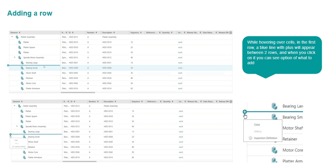
Adding a row:
When hovering between the cells, in the first column, a blue line with plus icon will appear, when you click on it, an option menu will appear, for adding a child or a sibling
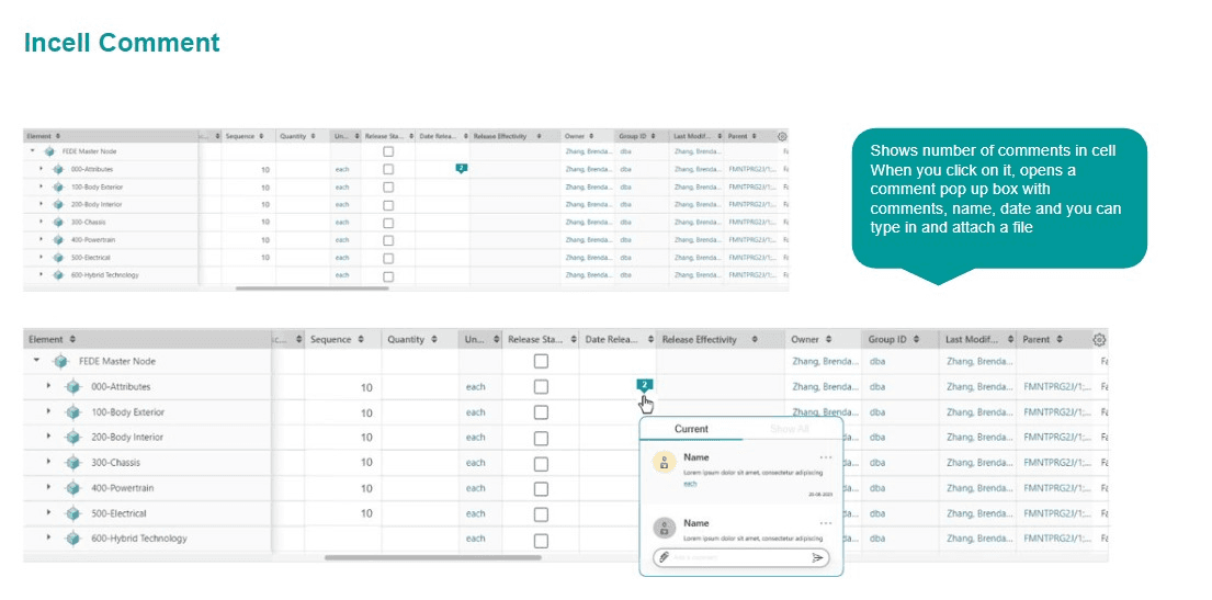
InCell Comment:
Shows number of comments in cell, when you click on it, it opens a comment box, with 2 tabs of current and show all.
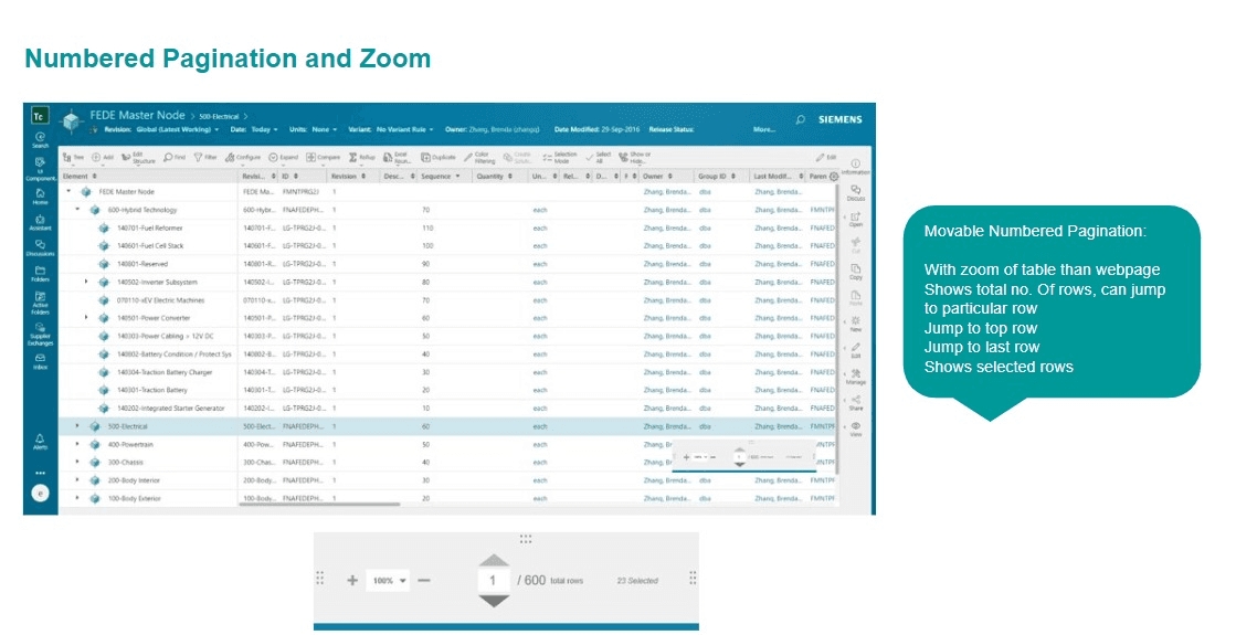
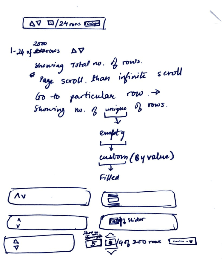
Movable(floating) numbered pagination and zoom:
With zoom of table than webpage
Shows total number of rows and can jump to a particular row
Jump to top or last row
Show selected rows only.
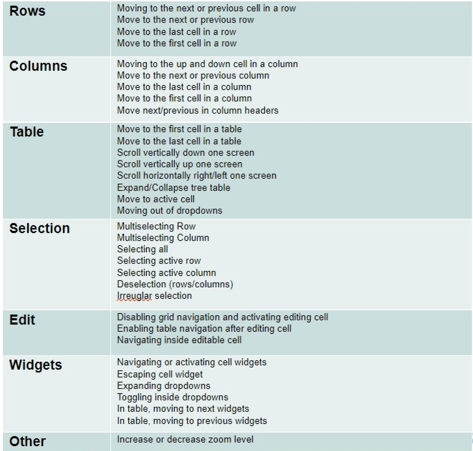
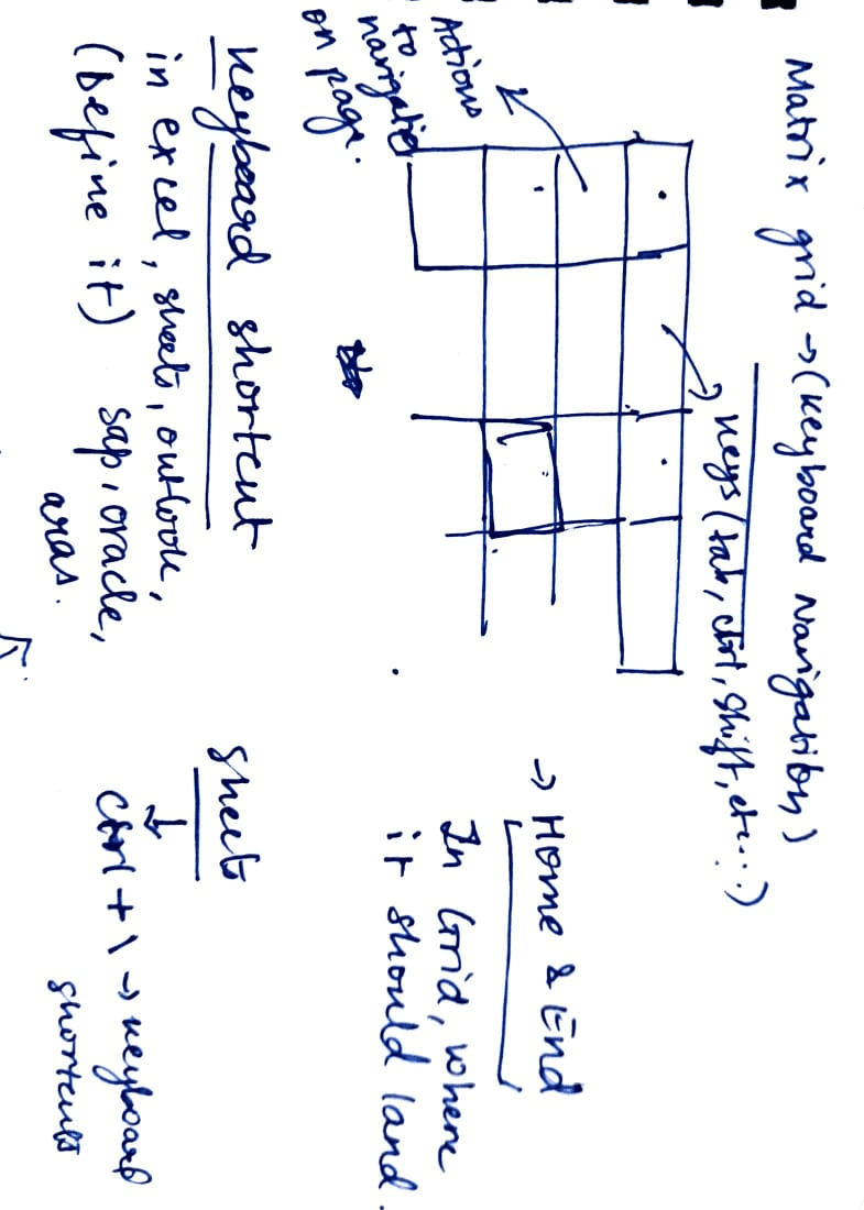
Understanding Tables Keyboard Navigation
Keyboard navigation is a crucial accessibility feature that caters to user personas who rely solely on the keyboard or prefer using it over a mouse. This functionality is especially important for individuals with visual impairments who may utilize braille keyboards for navigation.
To ensure comprehensive keyboard navigation, it's essential to outline the range of actions that users can perform using only the keyboard. Additionally, specifying which parts of the table these actions apply to helps create a more inclusive and user-friendly interface.
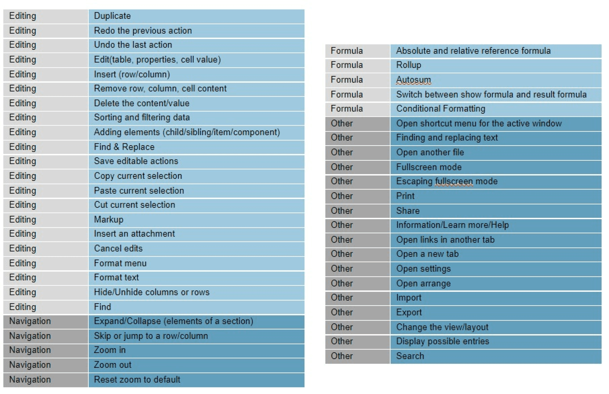
Understanding Tables Keyboard Shortcuts
Keyboard shortcuts play a pivotal role in enhancing accessibility, particularly for user personas who rely exclusively on keyboards or have a preference for keyboard navigation over the mouse. This functionality is of utmost importance for individuals with visual impairments, some of whom utilize braille keyboards for seamless navigation.
To ensure an inclusive user experience, it's essential to compile a list of actions that can be executed exclusively via keyboard shortcuts. Additionally, specifying which parts of the table these shortcuts apply to ensures that users can efficiently navigate and interact with tabular data, regardless of their preferred input method.
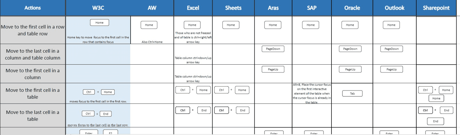
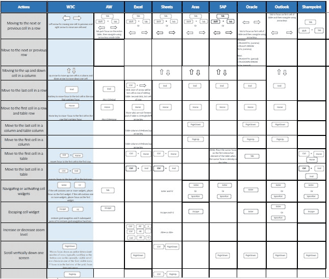
Comparative Analysis Keyboard Navigation
Guideline sheet with actions, W3C Guidelines, Keyboard Navigation in Active Workspace Tables, and competitors.
Competitors
Excel- Online & Desktop
Google Sheets
SAP
Aras
Oracle

Outlook

Sharepoint
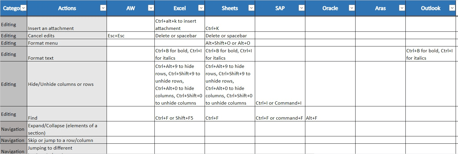
Comparative Analysis Keyboard Shortcuts
Guideline sheet with actions, Keyboard Navigation in Active Workspace Tables, and competitors.
Competitors
Excel- Online & Desktop
Google Sheets
SAP
Aras
Oracle
Outlook
Sharepoint
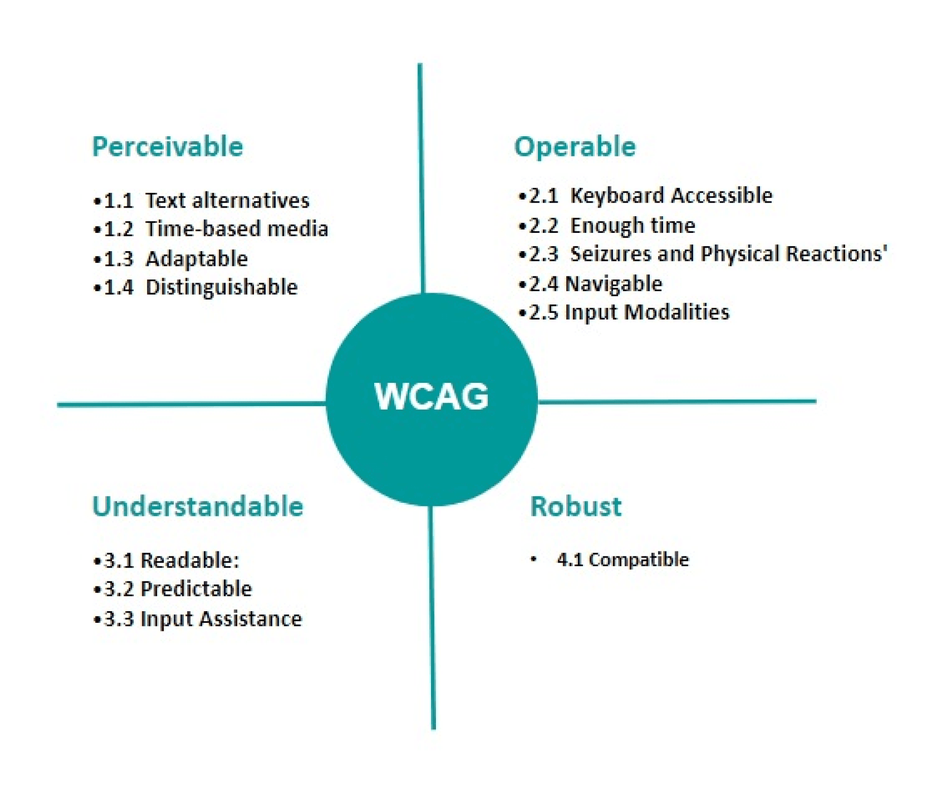
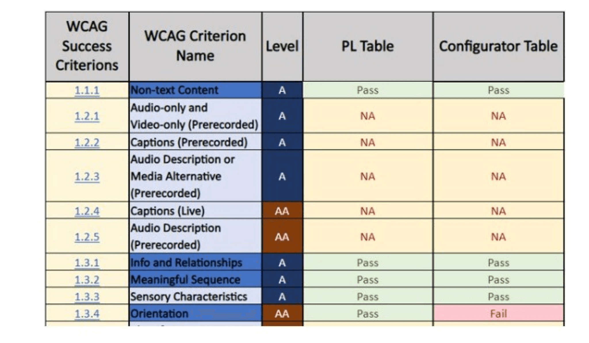
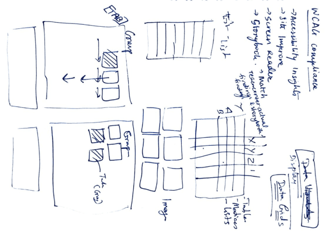
Checking Accessibilty: WCAG Guidelines
Accessibility Test conducted on Active Workspace Tables, also known as, PL Tables and Grid Matrix Configurator Table, using WCAG success criteria's, example, Contrast criteria, Orientation criteria, Images criteria, etc. Before I went in-depth, I first understood and learned WCAG Guidleines.
Tools used are

Accessibility Insights

Site Improve
Pass
LEGENDS
Not Applicable
Fail
Checking Accessibilty: Screen Reader
A screen reader is an assistive technology software or hardware device that interprets and converts digital text and graphical elements on a computer screen into synthesized speech or Braille output. This technology is primarily used by individuals with visual impairments to access and interact with digital content, including websites, applications, and documents.
Screen readers allow users to navigate, read, and interact with computers and mobile devices by audibly conveying the content displayed on the screen, making it accessible to those who cannot see or have limited vision.
Tools used are


Narrator Windows
ChromeVox: Chrome Extension
(Tool Used)
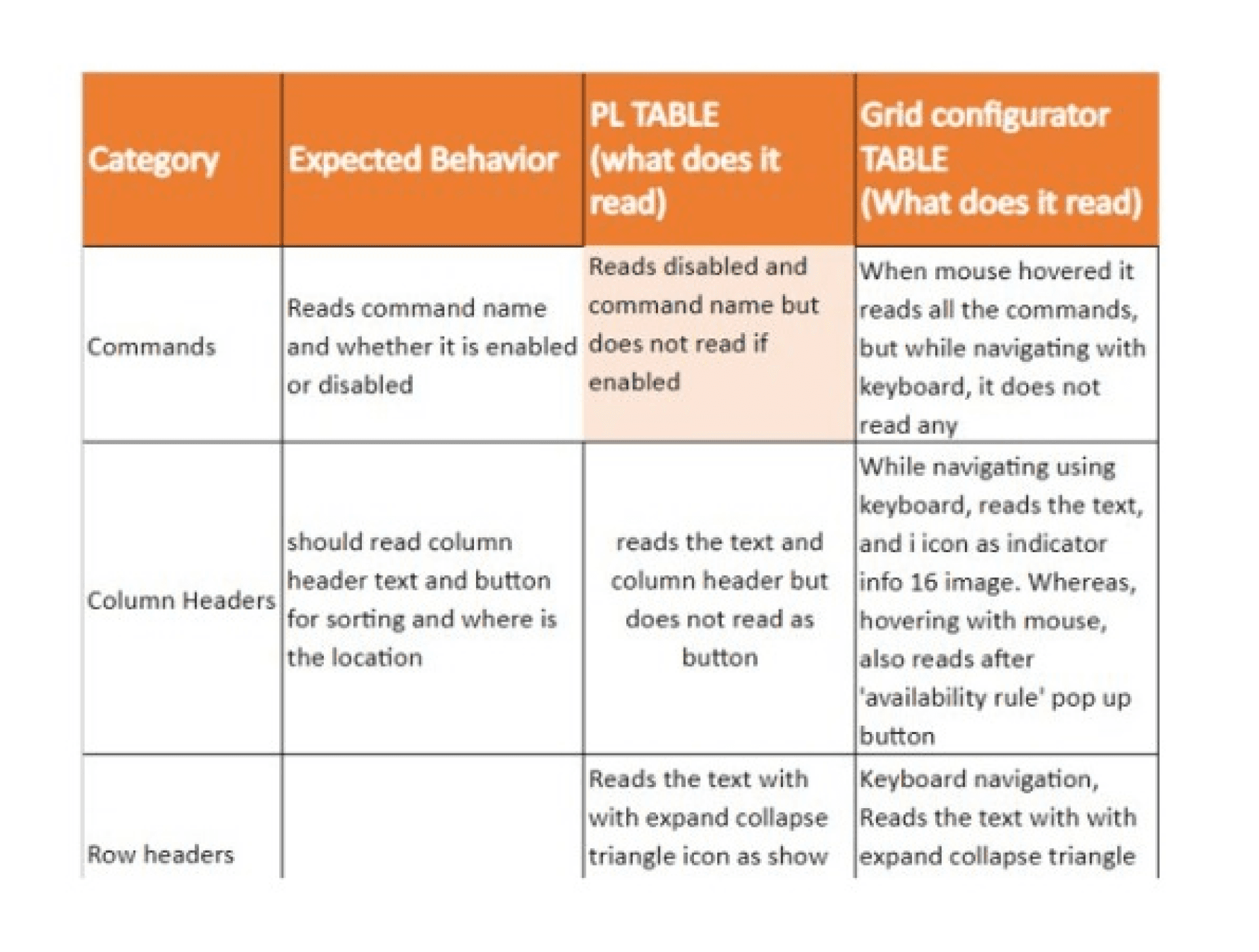
Expected Behavior of Screen Reader while reading tables
Commands: They should read command name and inform the user whether the command is enabled or disabled. Also, it should inform the user whether it is combo box, button, etc.
Column Headers: They should read the header text and button if necessary, example, filter or sort button is available. Also, with that read the location of header. Example, “ABC 3rd column header"
Cell Data: They should read cell data, and if hyperlink or widget inside should mention as “link” or “dropdown”. Also, read the location, example, “Design cell from 5th row and ABC column”
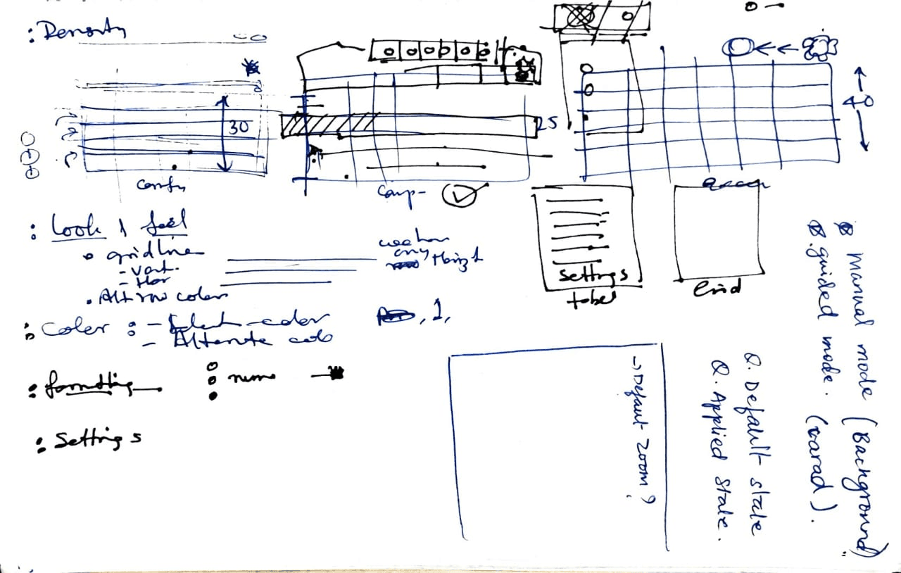
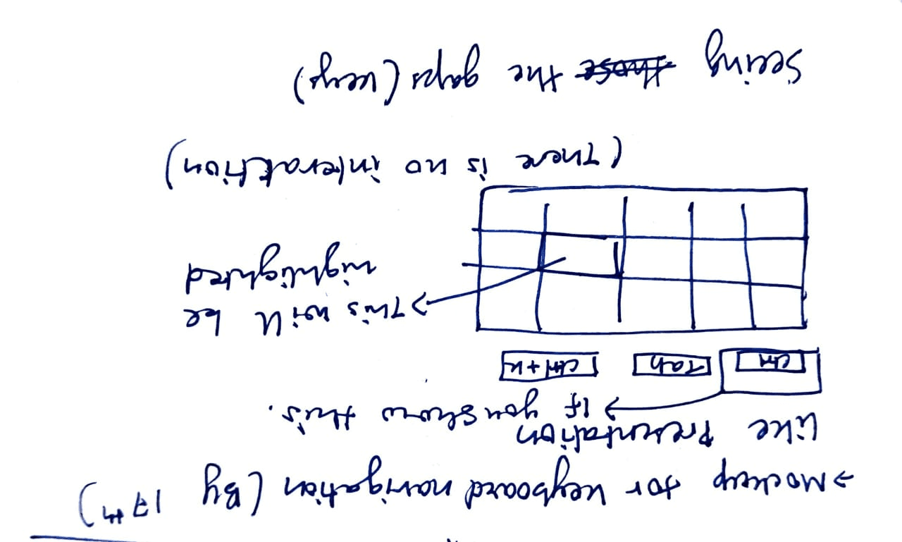
Some Rough Ideations on Paper
Ideation for mockups for keyboard navigation
Learning
Certainly, here are the key learning milestones from my internship experience, broken down into points:
1. PLM Software: Learning about Product Lifecycle Management and its significance in promoting lean manufacturing processes.
2. Design Process Testing: Exploring tools like eye-tracking, common in the gaming industry, and understanding the Beta testing process.
3. Project Planning: Understanding project planning and execution, including the allocation of time for designers and developers to work on features through user stories.
4. Seeing the Bigger Picture: Learning to envision the product's trajectory and aesthetics over a five-year horizon, even if not developed immediately.
5. Designing Data Tables: Recognizing the complexity in seemingly simple table designs.
6. Application of Knowledge and Research: Practically applying research and knowledge in decision-making processes.
7. Broadening Horizons: Adapting designs to cater to a wide range of user personas for inclusivity.
8. Art of Documentation: Understanding meticulous data documentation, including employee time tracking, onboarding/offboarding procedures, and issue resolution through ticketing.
These milestones collectively represent the valuable experiences and knowledge I acquired during my internship.